This is the first in a series of posts I will be making containing a variety of logos I have designed over the years. Some were used, some were turned down, and the rest I do for fun, so lets start the logo scrapbook!
Overton Darts League
I was approached online to help come up with ideas for a logo which could be used by a community darts league. They wanted something clean and simple for print and online use. The italicised text and enclosure give a feeling of activity and movement.
The Centre for Forensic Neuroscience
This logo design was submitted to the site LogoSauce for a competition to design the logo for a UK based agency who provide legal expert witnesses in criminal trials. I called it scatter-brain and the idea behind it was getting to the truth through the chaos. The general shape was meant to reflect the shape of the human brain.
Station Web Hosting
This was another submission to a LogoSauce competition, and what’s more, it was a winner! It started off as a very roughly conceived idea for the cord of a computer forming the letter S, but as it continued, it became more refined.
Inside Big Brother and Inside The X Factor
After the first year online for Inside Big Brother (previously BBUK Site), I decided to come up with some more permanent logos which could feature on both his sites. I wanted them to be fun, and bold, but for both to convey a uniform style so you knew they were related.
After showing them to the webmaster, he eventually declined to use them, but I still think the designs are interesting, and so they are still going into the scrapbook for all to see.
Thanks go to Lee Seaman for being my usual sounding board for ideas, and suggesting a few ideas which led to these.
CMYK Print Services
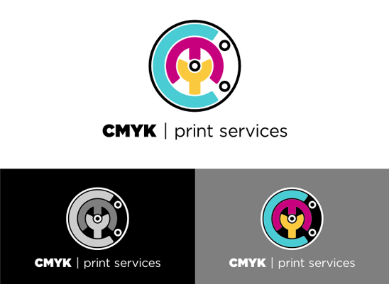
This design was another competition entry to LogoSauce. As the name suggests, the design had to reflect the world of professional printing, so I designed using colours influenced by the 4 colours Cyan Magenta Yellow and Black.
The mark design is intended to represent the types of printing marks used as indicators on the printed page for cropping, and folding etc.

Hi, I wonder how a tory-libdem combined logo would look? A ‘Bird’ and a ‘Tree, ‘Blue’ and ‘Yellow’, looks like it compliments each other already. But I would love to see your ideas on this.